Introduction
Design publications with a digital dissemination in mind
Scientific periodicals emerged in the seventeenth century (McDougall-Waters 2015), and to the present day, the design and structure of scientific articles is defined by these early paper-based publications (see Davis 2014). We use bibliographic citations that are related to the ways libraries manage journals and books. And for more precise references, we use page numbers.
The scientific world, however, is changing and the first place where researchers look for publications is no longer a physical library but the internet. While the scientific workflow is increasingly moving online, the way research is presented still follows an analogue logic. So the traditional design for paper-based publications, including page numbers, was transferred to the new environment in form of Postscript or PDF documents. They preserve the established layout but also contain a digital representation of the text. This implies, for example, that search engines can index PDF files, challenging traditional and complex systems for literature management like thesauri.
Along with the way literature is retrieved and accessed, online tools transformed the way researchers communicate, collaborate, and organise their careers. This includes research-specific services like ResearchGate, Mendeley, or LabFolder as well as more generic tools for online editing, collaboration, or communication (see (van Noorden 2014) and (Perkel 2014)). A variety of applications strive to facilitate citing and publishing research results online, yet the design for publications and citations remains the same. In this conceptual study we seek to rethink the narrative and design of scientific publications to meet the needs of changing modes of collaboration and reflect the potential of online publishing.
The share of research based on quantitative data is constantly increasing while the scientific community is still struggling to reference data sources appropriately. With citations being the most important currency for a scientific career (Fecher et al. 2015), we have to revise the way we include and cite data in publications. Comprehensive and interactive visualisations further enable researchers to make sense of and present complex data sets, multi-layered dependencies and real-time information. The integration of videos, animation, and dynamic content is no longer restricted to popular sciences and explicit fields of research but has found its way into articles of all kinds of academic disciplines.
At the same time the evolving complexity of societal phenomenons, economic systems, and political decisions challenge established practices in journalism. Data journalism and interactive content “is becoming the industry standard” (Rogers 2011). Although infographics are highly popular and find a rapid distribution via social media channels, well-researched and reliable content becomes even more indispensable to advocate transparency in a world of filter-bubbles and populist uprising. The growing complexity and challenge of evaluating the credibility and quality of journalistic content online urges the academia to accelerate their publication processes and provide openly accessible content.
Along current efforts to reform academic publishing, we challenge the traditional layout of a scientific publication. In this article, we propose a redesign based on both web-based and page-based technologies to advance the way we publish and yet provide compatibility to the existing publishing standards. Within that, we tackle the current way of scientific publishing in three aspects: on a technical level we aim to increase the use of open source formats. Further, we suggest that the publication in question is to meet the state-of-the art level of usability and interaction design to foster visually enhanced academic publishing. Finally, an overarching aim is to initiate an open and frank discourse on how to support the collaborative elements of scientific work and research processes.
In the following, we first describe the theoretical concept for an interactive publication design. After that, we suggest a basic technical implementation. And finally, we discuss the consequences of this new design for scientific communication and collaboration.
Concept
A multi-layer narrative
Traditional publications follow a linear narrative. Most scientific papers start with introducing one or more research questions, then outline the methods applied, present the results, and conclude with a discussion often evoking new research questions. This narrative is completed with an abstract and a list of literature, which the article refers to and an appendix suitable for additional material like small tables rather than for instance larger datasets.
Within this linear design, various objects can be included (see figure 1). However, visualisations and diagrams are non-interactive and limited in complexity. Citations are static and refer to an entry in the bibliography at the end of the document. Tables are static, too, and most of all limited by the size of the page. Videos, sounds and other multimedia content can only be included by reference to an external service. The appendix can be used to include additional objects or smaller tables which are separated from the text body and allow the reader to focus on the main part of the document. However, similar technical limitations as described before apply to the appendix.

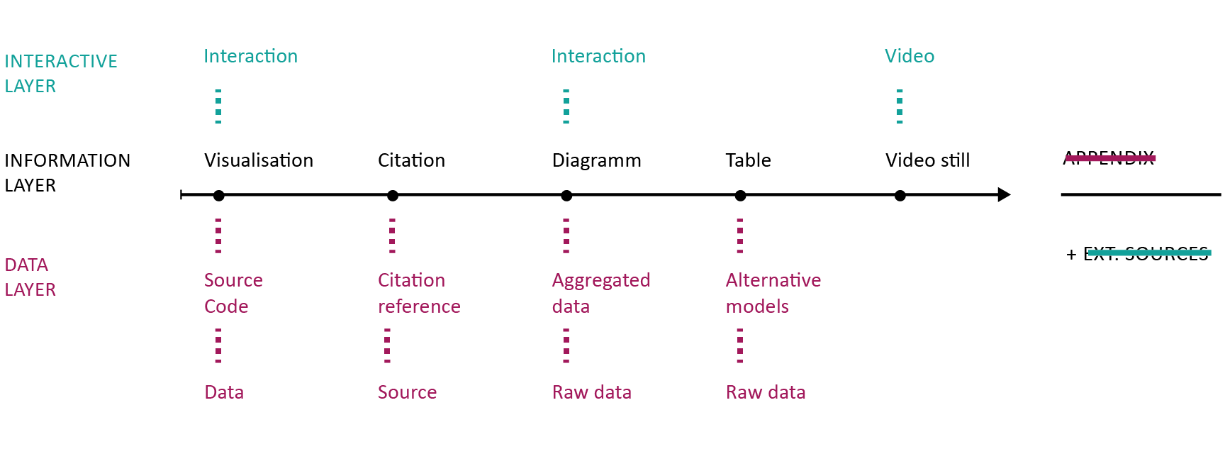
In contrast to this limited design, we would like to propose a multi-level approach (see figure 2). We distinguish three core layers in the document. First, the information layer, which basically represents the traditional design of an article. Second, the interactive layer allows the inclusion of multimedia objects, for example, videos or interactive visualisations and diagrams. Third, the data layer enables researchers to reference sources directly. These may be entire datasets, source code, interactive citations, and more. Further layers or sublayers are possible.
This approach empowers authors to address different audiences on multiple narration levels, e.g., address a broader audience in the main article yet still include further technical details for members of the respective scientific community. Or complement sections of the article that use exclusive technical language with explanatory paragraphs or further readings to make the article more accessible for audiences from other disciplines, politics, economy or the general public.
Looking at the data layer, a diagram can be supported by the aggregated data that are visible in diagram, the underlying raw data, and the source code that were used to generate the aggregated values. The integration of code and raw data is of particular relevance for the reproducibility of results. Psychological science came under fire most recently, when an increasing number of popular experiments failed to replicate (e.g., Jarret 2016, Open Science Collaboration 2015). This highlights the need for scientific publications to include all material necessary to reproduce or replicate their results. This not only includes the underlying research data but also the source code that was used to process and analyse the data. Furthermore, scientific results are not the only element that are generated by algorithms and code. Visualisations or interactive elements can also be based on code which can be valuable either to comprehend or to reuse as open source code in new publications. Moreover, providing the source code also enables the audience to produce unexpected, new interpretations or meanings based on the data.
Taking a look at practical examples of how research data is transferred in terms of usability, technical interoperability and visualisations within scientific publications, our sobering realisation is once again confirmed: in the classical field of academic publishing, most publications seem to be limited in terms of interactivity and supportive visualisations, also due to scientific rigor. Another reason is, that “in contrast to experts in visual communication, such as graphic designers – science communicators are not generally trained in visual literacy” (Rodríguez Estrada and Davis 2015, 142). User habits and the “visual speak” are oftentimes excluded in the academic publication process (ibid.). However, advantages through visually enhanced information as well as interactive elements are numerous. For example interactive elements can offer a “serendipitous value” (Melo and Carvalhais 2016, 40) for the reader encountering unexpected information – who is no longer just a primarily passive reader but an active user in a digitally enhanced user environment.
In contrast, data journalism, popular science as well as commercially motivated research activity present numerous projects that illustrate the growing requirements and complexity of data visualisations. And it comes as no surprise, that science leaps behind other (mainly industry related) fields regarding the popularity of infographics. Industries like health, entertainment, business and social media show the relevance of smart data visualisation like infographics.
Especially in the field of public and political institutions as well as popular science exemplary cases successfully transfer complex data sets in (interactive) infographics of high quality . Examples can be found on various levels: from Transparency International providing an interactive map on lobbying in Europe , the New York Times publishing a map showing government benefits throughout the US over three decades based on an interactive design as well as university projects visualising data about the effects of Airbnb in Berlin . Each of them offers an intuitive handling including interactive maps, supplemented for example by control parameters for specific information and data. Political bodies publish valuable information in increasingly interactive content: for example the Scottish Parliament shows in a well-prepared tool different aspects on the proposed budget for 2017 and 2018. The tool lets the user explore the allocation of budget on various detailed levels . Moreover, the German Government recently released an interactive report on life quality in Germany with a highly interactive design.
The examples above illustrate the possibilities to transfer complex information into low-threshold offerings in a mainly non-scientific context. Interactive elements allow readers a user-friendly and playful content perception. The reports show that interactive and user friendly reports with multiple layers of information as well as access to data sources are feasible. The current implementation of those reports, however, involves a significant amount of manual work, which makes it unrealistic for large-scale use. We therefore like to continue with our concept for a technical framework that lowers the barriers for researchers and journalists to produce both functionally and aesthetically enhanced publications.
Implementation
Extending existing solutions
The basic idea for the technical implementation is to work with plain text formats which can be transformed into the desired output formats automatically. The documentation generator Sphinx, originally implemented to generate the documentation for the Python programming language, provides a stable example for generating both PDF and HTML out of a simplified markup language called ReStructuredText. The community of the Ruby programming language and services like Github, however, prefer Markdown for a simple markup. In a direct comparison, Markdown can be considered to be a rather small subset of ReStructured Text, which makes it also significantly more user-friendly for beginners.
These formats are focused on simple text documents (Markdown) or on specific use cases like providing a documentation tool for a particular programming language (Sphinx). There have been first attempts to adopt these languages in the context of scientific publications (e.g. Scholarly Markdown ), but they all fall short on the proposed design for scientific publications as suggested in the previous section. This is mainly because they are developed with a linear storyline in mind without additional layers for data or interactive material.
Similar to Sphinx, we propose implementing a compiler for our plain text input format that generates the desired HTML and PDF outputs (see figure 3). Similar compilers already exist, for example the popular Pandoc tool or a variety of static page generators (e.g., ), but most of them lack even basic support for scientific publications. For the PDF output, we use LaTeX as an intermediate format to render the PDF files. LaTeX has proven to be easy to include in highly automated environments and comes with important features, like float environments for figures and tables, or comprehensive support for citations and bibliography. For the HTML output, we use a static site generator, which renders publication-ready HTML pages and the complementing material (CSS, JavaScript, images, etc.). The resulting output can be published on the internet directly or bundled as a ZIP file – all the user requires is a standard web browser. Interactive elements are realised in JavaScript and can also be rendered in the browser. On the publisher's side, the requirements might become more complex because the modularized design of the compiler allows the inclusion of more tools (e.g., R, Python or other libraries).

To realise the multi-layer design in our generic input format, we need an embracing standard that is able to bundle various media formats and layers. To stay in line with the discussion on the text format, we propose to use JSON as a container. This means that the heart of the technical implementation will be the definition for a container-object in JSON. This object would both hold the configuration for the entire document and bundle the content parts, which will be stored in separate files, by reference. A similar approach was already implemented by FidusWriter, an open-source tool for collaborative editing. FidusWriter, however, neither differentiates between multiple layers nor supports interactive elements.
With the container object in place, we no longer have to anticipate all possible content classes but create a flexible framework that is easy to extend with new modules. The requirement for new models would be to define a basic plain text interface and to be able to render into all necessary output formats, namely LaTeX/PDF (including static images) and HTML (including interactive JavaScript visualisations). Using the example of statistical graphs, we might start with a simple interface for rendering basic bar charts of scatter plots. However, the framework would enable programmers to easily integrate more complex tools as additional modules into the framework, for instance, the popular ggplot2 R-library as sophisticated tool for statistical visualisations.
For the long term, we expect HTML5 and related technologies (in particular, JavaScript, CSS, and SVG) to become the dominant standard for scientific publications, superseding the current use of Word and PDF files. As mentioned before, we intend to provide both static PDF and interactive HTML from one source, but it will not be possible to implement the full functionality we can provide with the HTML version into the static PDF format. In the PDF file, some functionality will only be available through links to the HTML version. For the following discussion, we will focus on HTML5 to illustrate the full potential.
In the previous section (Concept) we already identified a basic set of components, which can be implemented as a fundamental set of modules for our framework. Using HTML5 and JavaScript, we can build on a comprehensive set of libraries. For the table module, we suggest storing the data in CSV files and using libraries like jQuery-plugin DataTables . There are various JavaScript libraries for rendering graphs, visualisations and other interactive content (for example, D3 or paper.js ). For the initial calculation of the graph, the statistical software R provides a comprehensive set of tools, including the previously mentioned ggplot2 package. Furthermore, tools like Plotly already bridge the gap between R and JavaScript. Regarding images (photos), video, and audio, HTML5 (in comparison to previous versions of HTML) comes with sufficient functionality. A remaining challenge is to implement a flexible system for citation and references which satisfies academic requirements.
A specific challenge with the multi-layer approach, is the navigation through the layers. The core of the article is the information layer which contains links to the various levels of the data layer. We suggest that marginal notes provide an efficient solution to reference additional material (both internal and external) as part of the information layer, sparing us the necessity to implement a more complex navigation system. But most of all, the references are found next to the part of the article where they belong to, and not somewhere in a navigation bar. Furthermore, this implies that within the text part of the information layer, the paragraph would be the smallest entity to reference. On the technical level, each paragraph in the HTML document gets an ID (for example an UUID).
Discussion
Transparent author information and early access to results
The multi-layer design requires us to reconsider the way we reference and cite scientific material. This challenge is basically three-fold: First, how do we reference and therefore find an article as a whole? Second, how do we make more precise references within an article? And third, how do we acknowledge scientific contributions of individual researchers? In the old world, papers would be found in journals, provided to you by libraries. You could make more precise references using page numbers. And for the contribution, a significant amount of journals has a so-called impact factor, which is based on the number of citations their articles receive on average. As a researcher, you would basically sum up the impact factor for all the articles you have published, based on the impact factor of the respective journal that your article was published in, resulting in your aggregated impact factor. All three solutions fall short for interactive, multi-layer publications.
Identifier systems usually have two core characteristics. First, they should provide a consistent identifier that does not change over time. Second, this identifier should actually resolve to the content or material that it is expected to reference. In the scientific world, Digital Object Identifiers (DOI) have become increasingly popular to identify both entire articles and smaller entities (like figures or tables). The identifier system used on the internet, however, are Uniform Resource Identifiers (URI) which become increasingly important in times of the Internet of Things (IoT) and the rise of Semantic Web technologies. In general, we think that URIs are more suitable in the long run as they do not depend on a single, commercial provider and are directly tied to the internet as our primary distribution channel. Furthermore, URIs are better suited to reference nested material, as we find it in our multi-layer approach. In particular, we can use IDs and therefore anchors to identify individual paragraphs or objects.
Regarding the acknowledgment of scientific contributions, the traditional model is to list the authors of a publication in a particular order. Depending on the conventions of a scientific discipline, this order might be alphabetical or in respect of the contribution that individual authors made. The example of hyper-authorship, as for example in a publication from CERN (Aad et al. 2015) with 5154 authors, questions the traditional idea of authorship. In a multi-layer publication, we could start to disclose the particular contributions made by the authors and supporters of a publication (see Frische 2012).
Promoting the internet as the primary distribution channel can also open up the publication process. First, we can publish early work, during the development of the article. The W3C is already developing web standards like this and the Manning Early Access Program enables readers to access books even before publication. Second, the review process can become more transparent (Ford 2015). Third, the inclusion of (raw) data in a publication enables the reader to comprehend, reproduce, or even continue the analytical work. HTML pages, published on the internet, are easy to update enabling new workflows for the publication process. And fourth, scientific contributions can be represented more appropriately. In the multi-level design we can associate specific elements with individual authors and even specify the role of the contributor. We might distinguish contributors that collected data, analysed them, wrote the actual report or prepared visualizations.
Scientific articles are usually written with a specific audience in mind: the scientific community of a particular field. Popular science and scientific journalism, on the other hand, bring scientific results to a broader audience. The popularisation of scientific work allows a “recontextualisation” of academic content and discourse also with a less specialized community (Luzón 2013, 428). With our approach we hope to overcome this distinction: one article can now contain multiple layers of complexity, where one layer is focused on the members of one specific community, while another layer is more general and addresses people outside of this community.